Archive for the ‘3D Stuffs’ Category
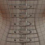
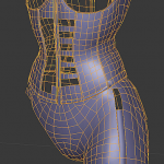
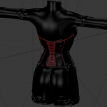
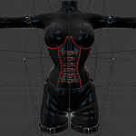
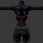
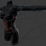
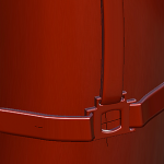
Corset is all buckled up.
That took about 4 hours. Now all that remain is the top (more straps gasp!) and the corset gap.
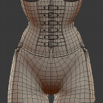
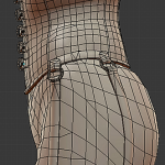
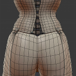
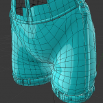
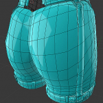
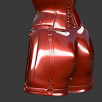
Shorts almost finished.
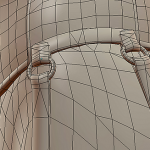
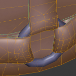
Those straps and rings running along the outfit are an absolute pain to make properly… or quickly.
If this wasn’t SL I would probably not have modeled them in detail like that.
And there is still a bunch more to build on the chest. Please kill me now 😀
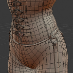
Good good progress.
I think this was about 7 hours straight, not bad for a monday!
Highpoly creasing DONE!
… Supposedly.
I spent the entire day drawing creases and deleting most of it until I eventually managed to get something that I find satisfactory.
I’m not saying that I won’t tweak a few things here and there, but this is as good as it is gonna get I’m afraid.
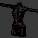
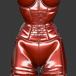
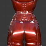
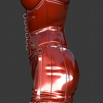
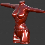
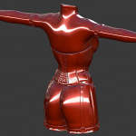
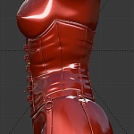
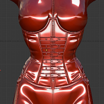
(Yes this is a bit of a picture dump, the two first are with the leather UVs but until i try to make it, I’m not entirely convinced that leather will look right, the other pictures are a “simili” latex test because SL materials behave a bit differently than what I normally do in Blender)
More creasing
And I do not like any of it.
Last details
I haven’t worked much in the past few days, I was sick and struggling with a bit of depression.
I’ve finished up the corset straps, added retainers, did the same for the leg straps and added loops around the legs to hold the leg straps in place. I’ve also added a pair of straps on the upper arms and built some sort of guard piece behind the lacing in the back and added the zipper for the crotch.
I can’t really think of what else to add really, so the last step (for the model itself) is to get it creased nicely. Then I’ll either work on materials, or start working on the low polygon model, to get an idea of what it will look like in world as quickly as possible.
Corset outfit update!
I started the day with the idea of using kind of a “3-way buckle” thing to connect everything together but it looked weird and didn’t match the O-rings used on the corset so I scrapped them and ended up with this result after a few hours. The shorts/legs will also have keepers to hold the straps, I just haven’t made them yet.
I wonder if the shorts are a little too juicy now…
Slight distraction
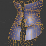
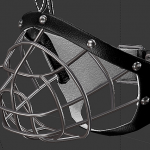
I wanted to make a wiremesh version…
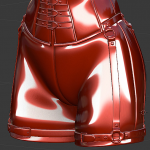
Shorts, garters, zips and more creases.
Overall, some progress towards the final version and ANOTHER creasing attempt which I don’t think I’ll keep.
More details?
This doesn’t look like much but it was a bitch to make this detail junction look right. This should give me enough space to rivet some cool garters 😛
I didn’t have much time and my sleep cycle is all messed up again, sorry!
