Redesigning the shop
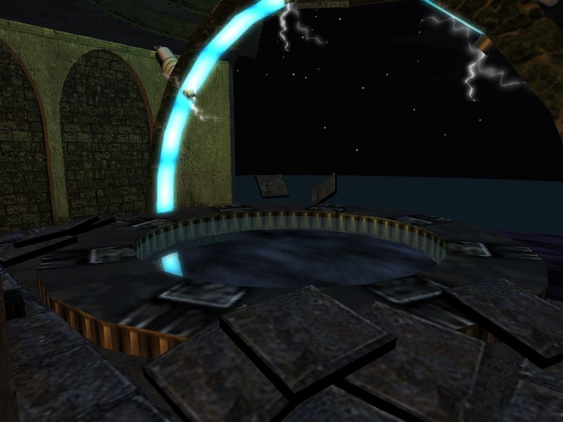
The old shop: What wasn’t really that good.
This has been bugging me for a while, since i moved my shop from the mainland to dead realm, i never had the courage to reconsider what i actually built, and frankly, as different and otherworldly it looked, from a shopper point of view it probably was less than stellar.
- From a practical point of view, it was very difficult to add more products, once one of the “hubs” was filled, I had to build a new one, which would be mostly empty at the start.
- Even if i took great care to prevent Peoples from falling down with a lot of invisible prims, walking around on mostly black structures, dangling over a precipice was less than ideal for new users.
- The 4 circular hubs connected by jagged paths, even with signage was not really the most efficient shopper experience, you would walk around trying to find what you wanted, and you would double back very often. I even frustrated myself going back and forth between the two clothing hubs, unable to find the product i wanted to update.
- It is way too dark, i don’t think that i had calibration equipment at the time for my displays but it is way too low on the light spectrum to work for most Peoples.


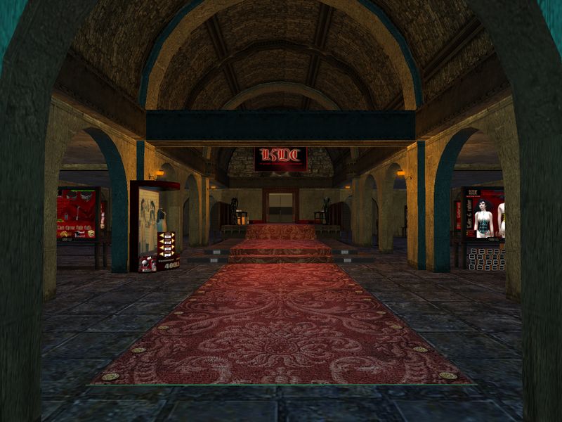
The new shop: What I am trying to address.
- It is now inside a building, only the telehub remain the same and is partially open to let me add platforms later, I’m still going to keep the same dark otherworldly theme.
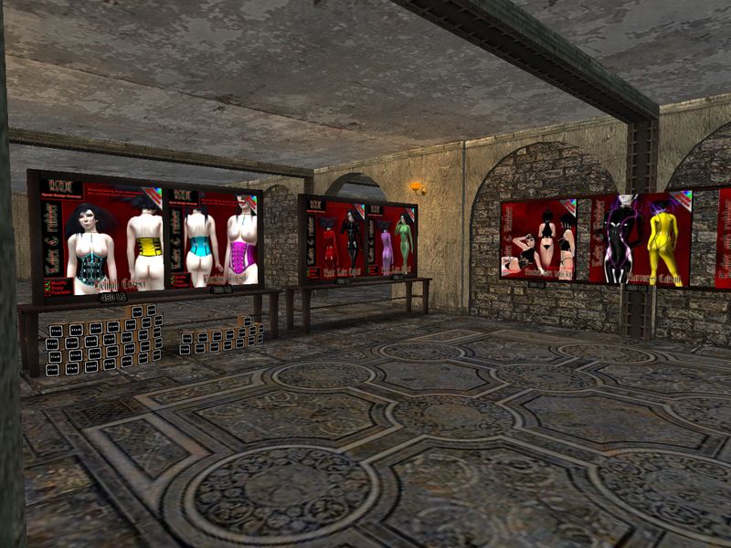
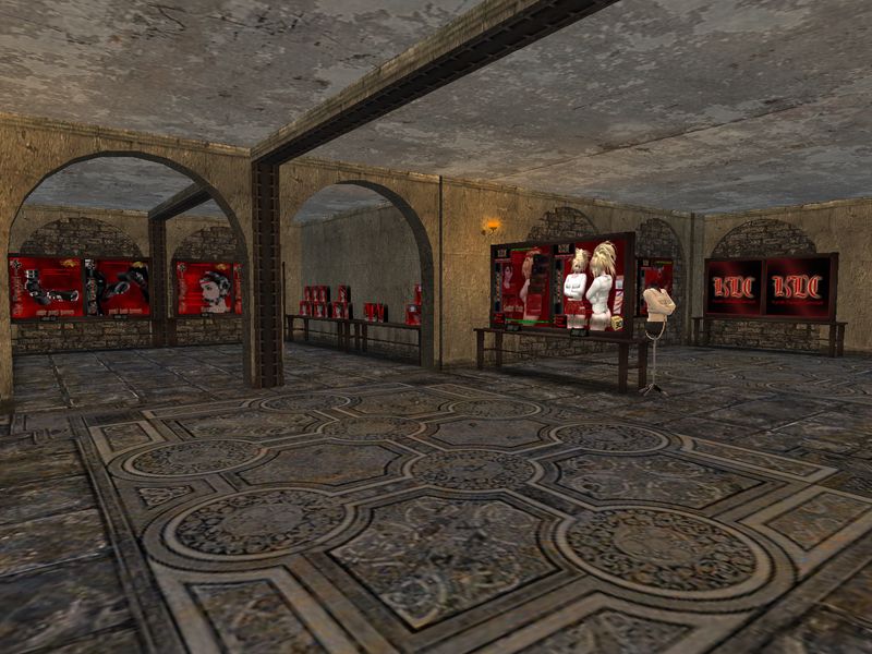
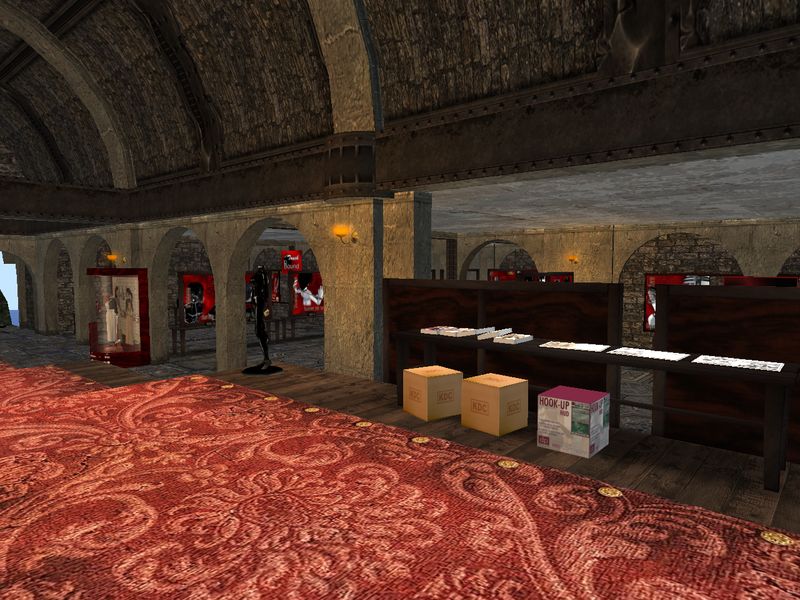
- The layout is much more compact and focused, there is a central alley leading to the freebie area and the lift to the ground level, on the left everything Bondage like, and on the right everything related to latex and clothing.
- From a builder’s point of view, easy to expand. The structure is very modular and can be easily enlarged from each side, when needed.
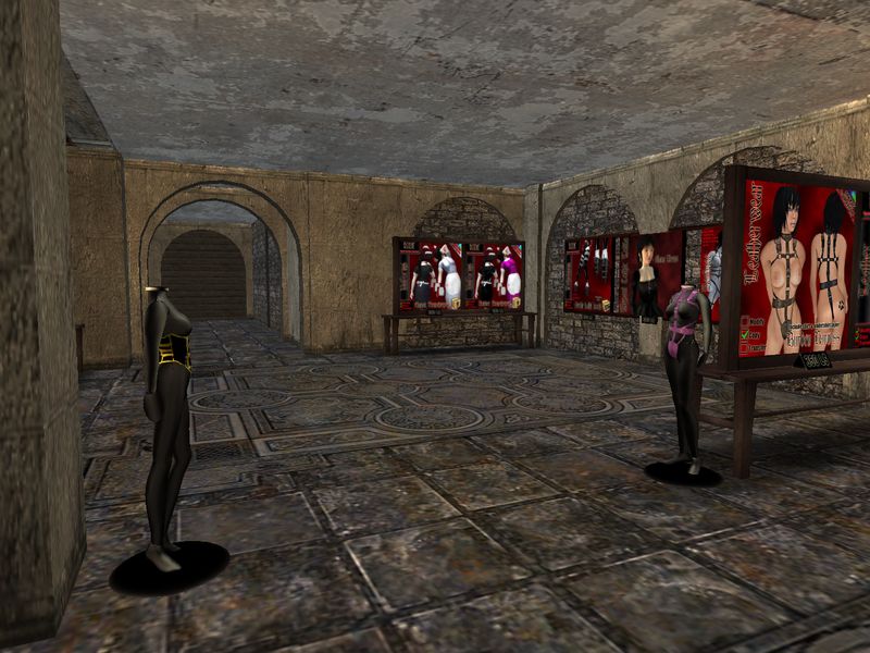
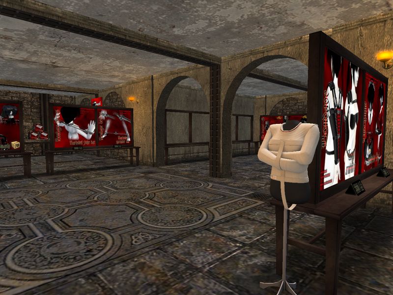
- The lighting is bright and warm, it’s flattering the structure and reinforcing the sort of private dungeon feel.
- It looks like a fancy virtual boutique for BDSM shoppers, it has mannequins wearing fetish gears and display cases for some accessories.


I love the photos, and can’t wait to visit. =]
I remember teleporting to the sky shop when it was pretty much brand new (nearly five years ago!) and how it blew my mind as not being a ‘cookie cutter’ sim with mediterranean beaches and palm trees. It inspired me to take a darker, more original path through SL, and to not settle with the defaults and to challenge pre-conceptions. That TP hub/spinning gyroscope/tesla thing was like magic to me.
I’ll miss the sky shop, but it’s great to see KDC move forwards.
Love the mannequins and glass cases! A real “shop” look, as opposed to many people’s “blank space with vending machines”
Can’t wait to visit!
i love the new design of the shop space pretty lady. it looks functional elegant. and more importantly. like a store.. dont get me wrong the darkness was cool.. but i think this will be much more friendly for newer avies. you did great!
lots of love forever
sharny