Archive for the ‘3D Stuffs’ Category
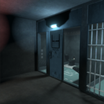
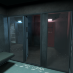
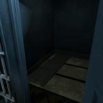
Prison Cell Block D-5 update!
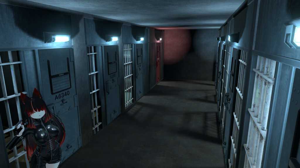
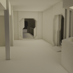
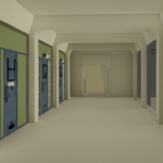
I’ve finally updated the Prison Cell Block D-5!
Nothing major, but there are some improvements and additions:
- The world has (finally) been updated to Unity 2022.3.22f1.
- Fixed the reflection probe problem at the end of the corridor.
- Fixed post processing & color grading.
- Rebuilt all the light probe groups I accidentally broke 2 years ago.
- The cell facing isolation has been upgraded to a secure observation cell with polycarbonate panels.
- All the cells have been renumbered, the lettering has been softened to blend in better.
- Door logic has been completely rewritten, rookie mistakes have been fixed, and everything now responds much faster (from 4 seconds to ~1 second for clients).
- Colliders and seats are finally disabled by default.
- An ambient droning sound fills the silence.
- Corrected the plumbing used by low and high security cells.
Added thin mattresses to the small cells for (slightly) improved living conditions.
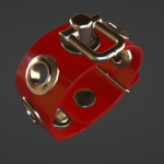
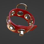
Vergilius wrist cuff WIP and more.
Lots of pictures to show today, progress on the Vergilius wrist cuffs, and more! I wonder if patreon will show all of them…
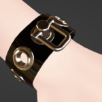
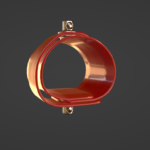
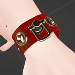
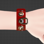
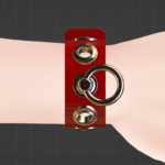
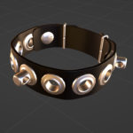
Mesh wise, the cuffs are pretty much ready. I still have to code & configure them but that shouldn’t take too long (unless, well, mistakes). I am a little late (it’s almost midnight) for today’s update but I had to urgently redo my LODs because I made a stupid mistake and left a bunch of gaps between the strap and the eyelets.
I’ll add the shackle as a variant to the Vergilius Collar in an update, and replace the product picture accordingly.
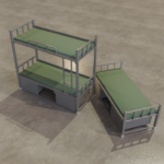
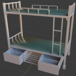
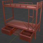
Over the weekend I’ve also fixed the proportions on the bunk beds, it was mostly correct, but the lower bunk was way too low. I’ve also made a single version. The bins aren’t quite there yet, but almost.
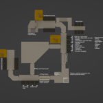
I’ve also done a fair amounty of brainstorming on the prison layout and solved a handful of issues I had with it (created a few more too).
I’m also trying to pick up the habit of leaving notes in projects rather than putting them on a separate pad/text file. I saw someone do this the other day, and thought this was a good idea.
Vergilius wrist cuffs, low poly and other things
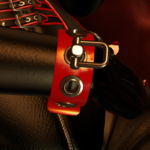
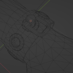
Quick update on the Vergilius wrist cuffs, I’ve almost completed the main low-polygon model (highest LOD). I don’t think this will require a normal map (just like with the collar) But I spent more time to get the surface as smooth as possible, polygon-wise yet not completely flat (the rubber presses down flat around the grommets rather than being perfectly cylindrical). It should catch a bit more light that way
I swear I’m not trying to double/triple stack my projects on the purpose, but as you can see, I’ve started working on a piece of furniture. I’m thinking about making a small “kit” to provide some variation on the current cell furnitures. This looks more suitable for a dorm I suppose.
The measurements are a little off but I wanted to bang out a first draft as quickly as possible, I’ll do some more research and adjust the proportions of everything accordingly.
Vergilius rubber cuffs started!
This is attempt number two on the Vergilius rubber cuffs. The first attempt was kind of a “classic” bondage cuff design, with the liner and everything, and I spent way too long working on that one before realizing it didn’t really match the style. On top of that, adding more eyelets would means no real way of attaching the buckling strap to the liner.
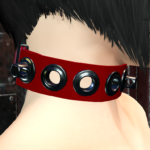
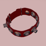
So I scrapped that and made a second attempt, this one matches the collar a lot better as you can see, I ended up spacing the hardware just a little more to compensate for the tighter radius.
I’m playing with the idea of adding a ring, or some kind of shackle to the chaining point rather than having it be a naked post, as it currently is on the collar. I would of course add it to the collar if I do, feel free to tell me what you think of that.
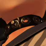
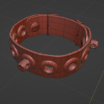
I’ve spent a lot more time shaping the rubber to make it visually deform around the hardware, I don’t know if the pictures do any justice to it, and I have no idea if it will transfer that well to low-poly.
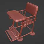
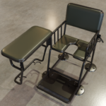
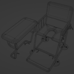
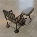
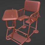
Hey look, more interrogation chair pics
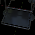
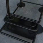
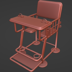
After rebuilding almost everything on the interrogation chair in low-poly (and pretty much all the 90° turns because none of them was square), the model currently clocks at 6600 triangles, across 5 objects.
Ratcheting only one side of the wrist restraints cuts down a little less than a thousand triangles. I could probably bake those teeth into a texture?
I’m super happy of the “lock” redesign, it is still crude & simple to use and hypothetically manufacture, but it now looks like it is suitably load-bearing…You probably could stand on top of the tray and it wouldn’t sag in any way.
All in all, this isn’t really a priority project but I kept going back to it over the weekend.
I’d like to move onto the wrist cuffs for the vergilius set relatively quickly, but I need to do a little bit of research first, to be sure.
Stunprod update, chastity belt WIP
Quick update because a few things have happened since yesterday:
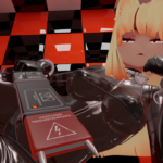
A kind soul on the KDC Booth Store reported an issue with the parameter setup of the VRChat Stunprod. That is now fixed and you can download the package (version 1.2) to correct the problem (the Patreon reward has also been updated).
Someone also made me aware of a packaging/assembly error with the KDC Lined Chrome Chastity belt; There are floating chain links on points that cannot receive or send chains, making it impossible to remove them. The fix is relatively simple but it took a moment to figure out what exactly happened.
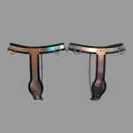
I was also considering putting out some PBR related fixes and ended up starting a full PBR refresh of the material, picture included: on the left is the original and on the right, the PBR version. Nothing fancy, that’s more or less what it would have looked like if we had decent metal rendering back then.
If I actually do this I’m gonna have to do some edits in the HUD & labia shroud code to dual-stack the two material systems, the same way I’ve done with the Stunprod.
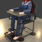
Interrogation chair thing
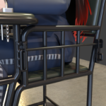
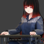
Here is another attempt at the interrogation chair project, I like it a lot more than my previous attempts which I’m not sure I’ve ever posted here. I was hoping to integrate some kind of knee-spreader, but so far, cannot figure out of a good approach that also fits the overall design of this contraption.
I look so unhappy in this pictures, ^_^ I wonder why!
Blender’s renderer & denoising have really come a long way, and this is nearly at real-time speed on GPU compute. Would you look at that.
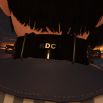
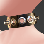
As for the Vergilius collar, I finished writing the code yesterday, I was going to do product pictures, manuals, and all those little things but my home server appears to have given up the ghost, which pretty much ate the rest of the afternoon.
I haven’t entirely lost hope but I might have to look for a replacement… and an IDE drive adapter of sort (it is THAT old). Thankfully, it did not contain much of value other than lots of scripts and somewhat useful services and things I figured out over the years. For the time being, I’ve moved the really important stuff (customer mails & sale reports) to a different machine.
Setbacks and uncertainties.
Alright we’ve had a few setbacks. Last minute change and I decided to add an occlusion map, which required of me to try a bit harder with my UVs, which also required rebuilding the LOD models that I thought I was done with Monday.
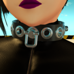
I’ve also decided of a name for this line “Vergilius”; It has a nice ring to it.
There is a problem however, and that is related to the script/behavior. I really have two options with this slightly unusual “side locking” system:
- Option A: Treat both lock points as one, simple to use, but that means they cannot be chained to or from.
- Option B: Treat both points independently, that means the collar would only be RLV-locked if BOTH lock points are fitted with a padlock, both would then be valid chain targets and sources (side collar points currently only exist on the braced collar)
EDIT: You can vote which option you prefer here.
Rubbery bondage stuff.
PBR is officially out, right? It’s been for months on the official viewer, and is now on Firestorm, which means that it is out for 99.9% of the user base.
I’ve decided to try my hands at a quick little project and see how well it ends up doing.
In general, I tend to avoid making latex products unless it is something truly special, as there is little point in competing with creators that pump that stuff out all year round. That being said, I think I’ve gotten pretty good at making actual, realistic latex/rubber using PBR materials, and people have been asking for a serviceable rubber set for literally years at this point.
This will be PBR-only (sure, try to change my mind on that one) and should be super easy to recolor and mod. I think I’ll also keep the front pin/post as a separate mesh, this way you can move it in another hole if you don’t want it centered, for some reason.
More LPM work & some VRC work too.
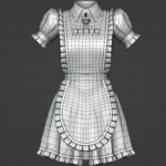
Ended up going with modeling the LPM apron bib after all. A bit dense but it is probably okay. There really isn’t that much left to model at this point, and I’m going to HAVE to move to the more nerve wracking parts…
I’ve actually gotten the logic for the VRChat version of the stunprod nearly done over the weekend. The behavior is pretty much identical to the one in SL, but in SL you can’t do screen-space shader shenanigans :3
